

The Give Lively logo has three components: typemark, logomark and lockup. The typemark and logomark (shown and described below) can represent Give Lively separately or be combined as the lockup. See adjacent for the lockup.
The lockup is the most complete Give Lively logo, with the typemark and logomark set in their relative positions. It should always be used when the brand is fully represented, especially to a new audience.
Shown in the adjacent illustration as gray extensions, clearspace is the area of empty space surrounding the logo. This padding allows for the uncluttered visibility and proper impact of the logo.
For the lockup or typemark, the clearspace is equal to the height or width of the logomark. For the logomark, the clearspace is equal to the height of its middle element.
For maximum readability, the lockup should never be smaller than 150 px in width, and the logomark should never be smaller than 16 px in width.

When the Give Lively name must be communicated, but there is a need for simplicity, the typemark (also known as a logotype) can be used without the logomark.
The Give Lively typemark is a modified typeface. It should be an image file that preserves its specific structure and spacing.
The Give Lively logomark is a visual metaphor for the company’s commitment to helping nonprofits grow. The shapes allude to a growing plant with the seed on the left and the progression of a growing stem to the right. These plant-like shapes also represent the organic, intuitive user experiences Give Lively produces.
Employed on its own, the logomark is a powerful way to represent the Give Lively brand. For people unfamiliar with the Give Lively brand, the logomark creates intrigue; for those more familiar, it can serve as an efficient textless representation.

Logomark as Give Lively avatar
In certain situations, the Give Lively logomark can appear in pure white and be placed within a circle of Give Lively blue. The primary instances for this use case include: when the logomark would otherwise float in white space or not stand out effectively at a small scale. For example, this is a good solution for an Instagram icon (see adjacent).
Proper use of logo
The Give Lively logo (typemark, logomark and lockup) should appear in color wherever applicable and in pure white or charcoal gray when necessary for contrast. The examples below illustrate proper use of the logo over various backgrounds.
What to avoid
Do not alter the Give Lively logo in any way. The examples below show improper uses of the logo.
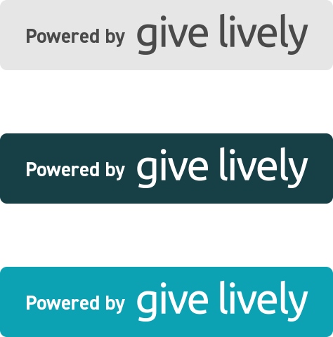
This badge is the visual reminder that Give Lively technology underpins an organization’s fundraising efforts. It shows that we created the technology and have a business relationship with the organization. For example, the “Powered by Give Lively” badge is visible on Branded Donation Widgets within nonprofits' websites and on Charity Navigator’s Giving Basket, which Give Lively administers.